How to Create a Memorable Logo for Apartment Buildings
Your logo is crucial to making a good first impression with prospective tenants, it's the face of your brand, it's what will draw people to get to know you more. With so many property and corporate brands out there, it can be a little overwhelming when it comes to making decisions on your visual identity, so let's go over the basics.
Ask the right questions
Every good design starts with getting the right information, and to do that we have to ask the right questions: who, what, where, when, and why.
-
Who are you, who are you providing a space for, and who is your competition?
-
What do you represent, what do you offer, and what are you trying to achieve?
-
Where is the property located?
-
Where do you see yourself in the future?
-
When will the property be ready, and when will the next steps be taken?
-
Why is this so important?
-
Why should prospects rent here and not somewhere else?
These are some of the questions that help build your brand identity and help us answer the 'hows'. However it may seem, no question is ever too small or too big. Sometimes you don't have all of the answers, and that's OK, we're here to help fill in those blanks.
Create a clear vision
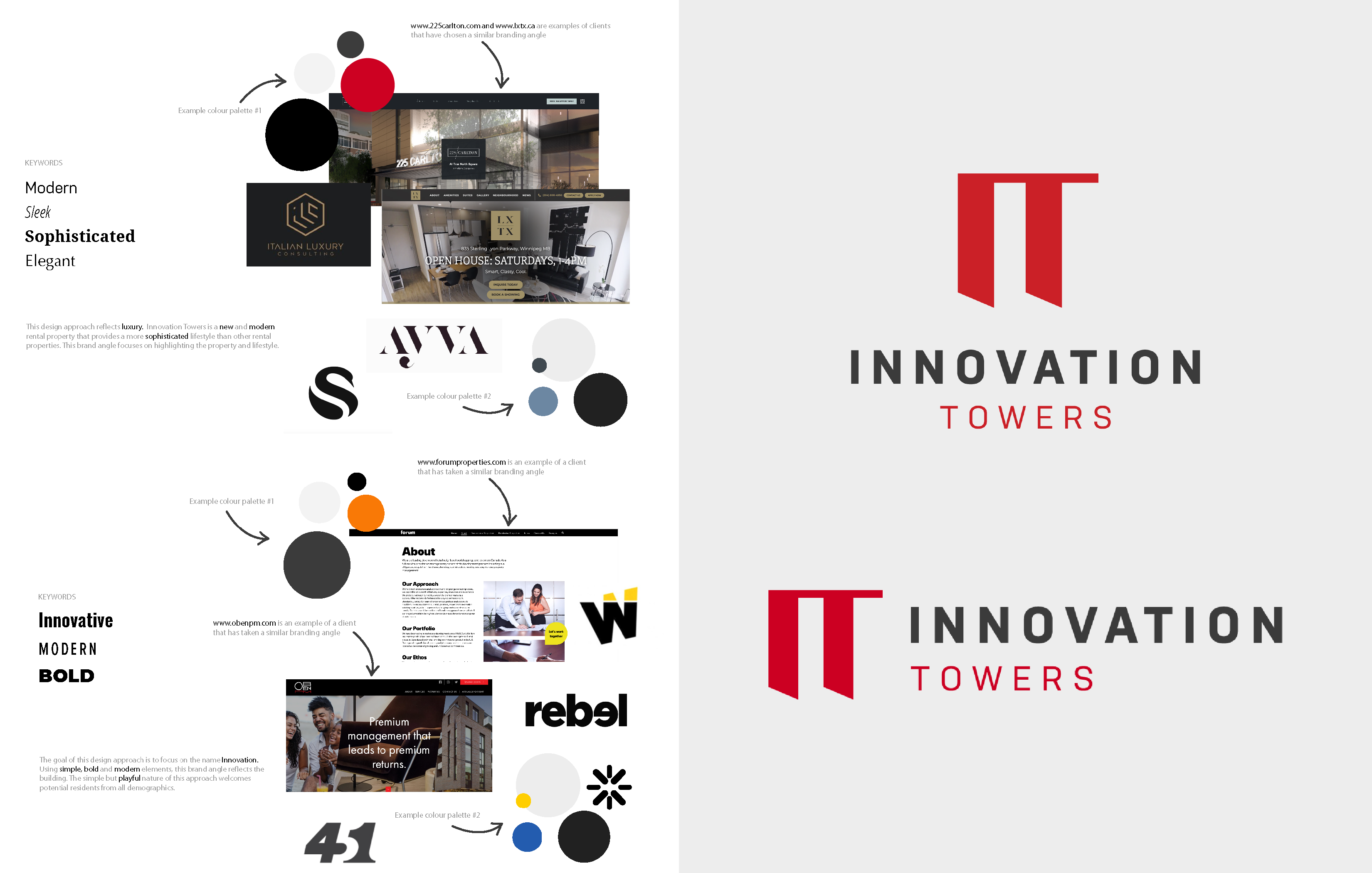
Some companies know exactly what they're looking for when it comes to brand tone and style, and others need some guidance. There's no right answer when it comes to what approach to take, but it should be consistent with the property and demographic. Identifying some keywords will help set the right tone, decide key design elements like colours and fonts, and guide concepts; serious vs. playful, high-end vs. casual, traditional vs. modern, etc. Establishing the desired feel gives us a strong starting point for putting together moodboards and initial concepts.
Example Moodboard for Innovation Towers
Keep it simple, stupid
Simple isn't bad, it's actually really important because a simple logo is going to be… well, simple to remember.
When we look at some of the most recognizable brands in the world like Nike, Apple, or Google, and separate the logo from the rest of the brand, we're left with a lot of room for interpretation. A logo's job is to capture the essence of your brand, to identify and give us just enough information. We need logos to be impactful and memorable more than we need them to be oversaturated with visual information—the rest of the brand can do the heavy lifting, so don't overcomplicate!
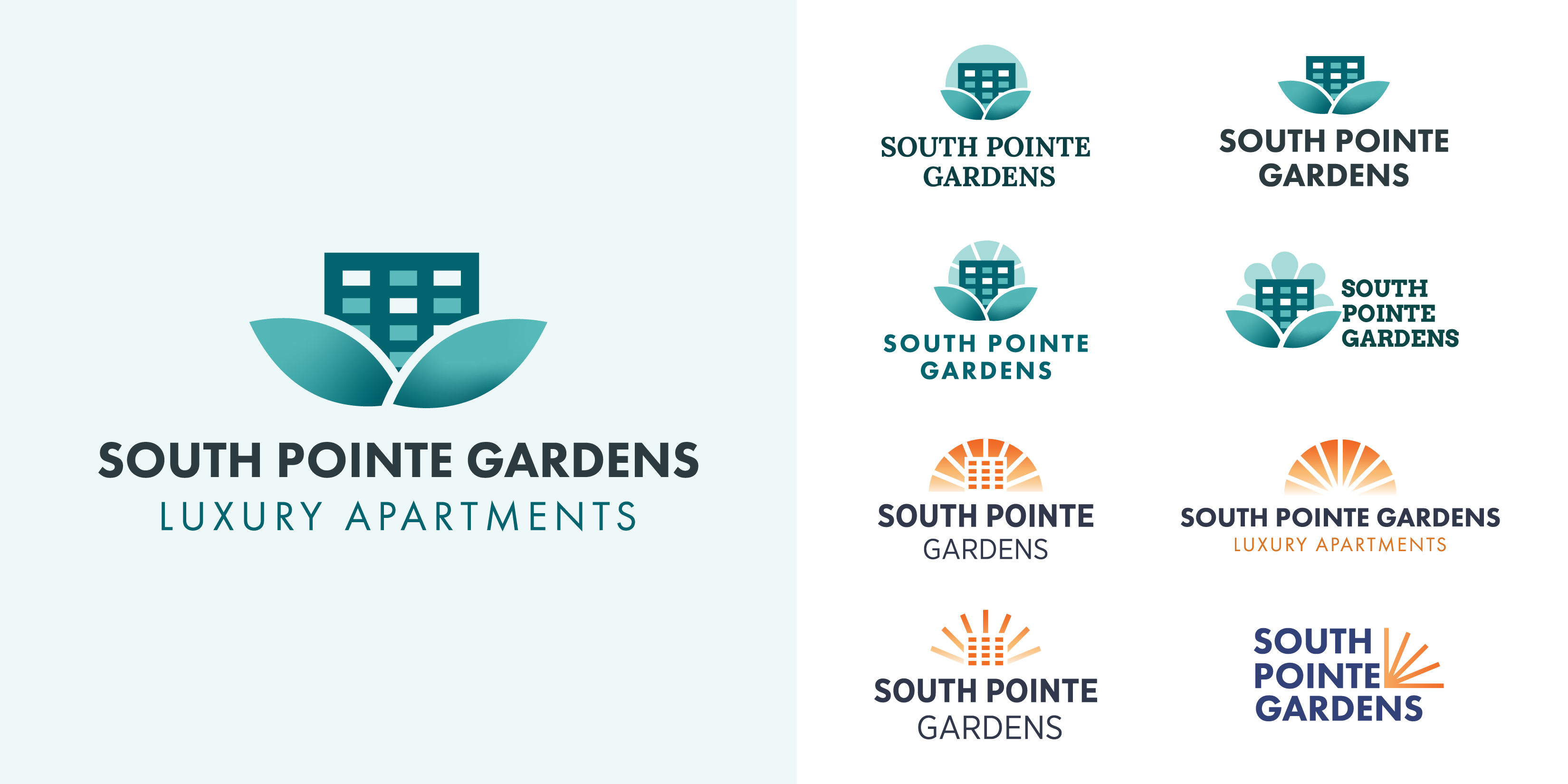
Logo Concepts vs. Final Design: South Pointe Gardens

Be unique
It's hard to ignore the clichés of the industry sometimes, but try your best not to get too caught up in the obvious. It's best to keep an open mind, and not close doors on concepts too soon out of fear of not fitting in or trying to play it too safe.
Check out what your competition is doing, but use it as an opportunity to set yourself apart, not to follow in their footsteps. Remember that it's better to stand out from your competition, not match them.
If you're always looking in the same place, you're always going to see the same things, so it can be especially helpful to look at brands outside of the industry for inspiration, too. Consider brands that share the same target demographic, similar location, common values, or desired personality.
Be versatile
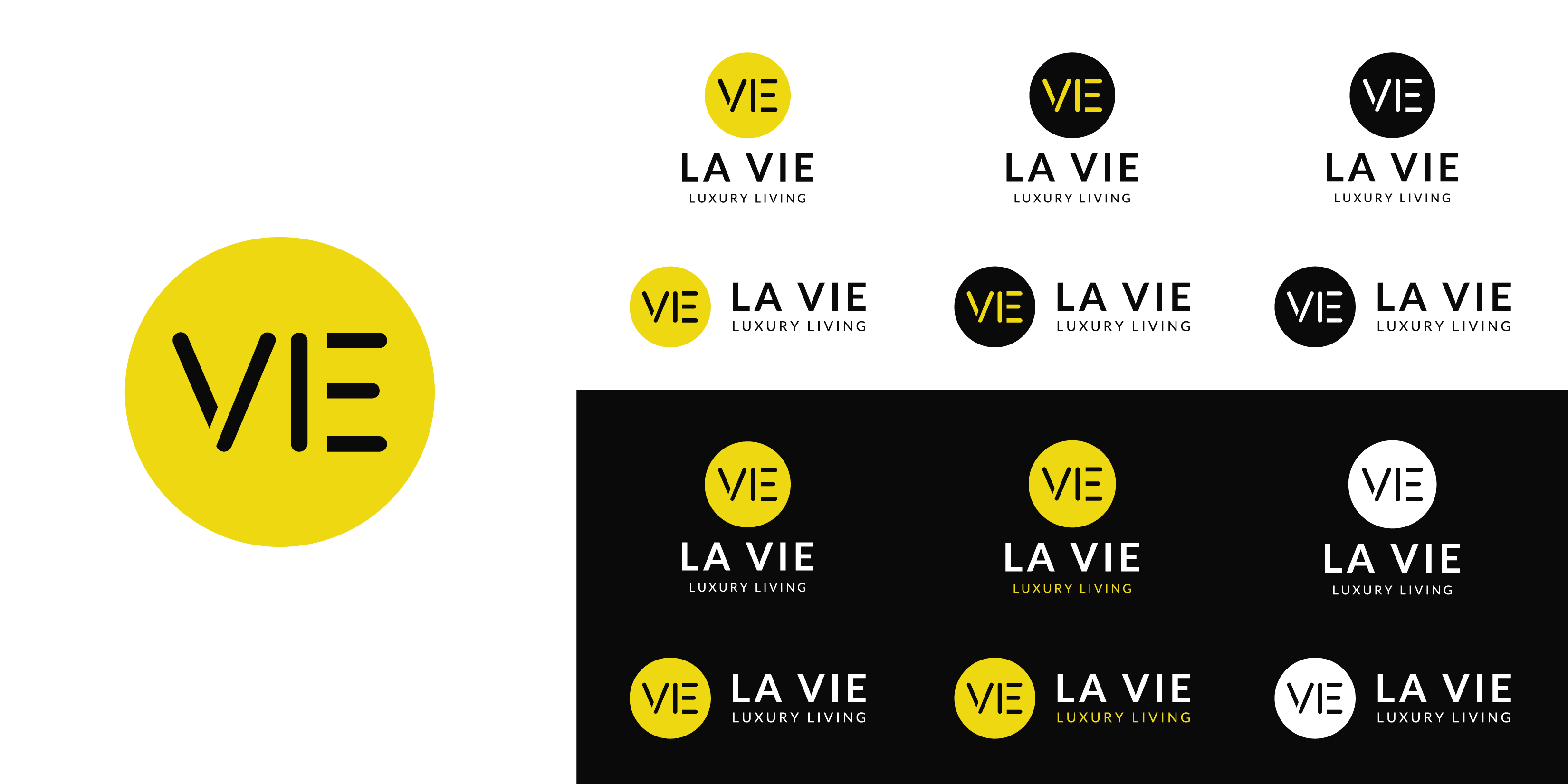
As the face of your brand, your logo is going to be everywhere, so the more versatile it is the better. Again, keep the design simple, and take into account where your logo will be used; website, social media, signage, swag, etc. Maybe you don't always need a tagline, or maybe you need a vertical version for your brochures—you'll definitely need one in black. It's important to cover all use cases with variations of your logo to get the job done, no matter what.
Example Logo Variations: La Vie Luxury Living
Follow through
"The brand is really where the personality comes into play...the logo is the face, but you don't know somebody you just meet by looking at their face, you have to get to know their personality...that's the difference between the logo and the rest of the brand, really." – Kristen Cardwell, Marketing Designer at Rentsync
However important the logo may be, a logo doesn't equal a brand. Now that you've put a face to the name, it's time to show the world your whole personality and develop the rest of your brand. Your website, print, and digital marketing materials should be consistent and allow prospects to get to know you better through design, imagery, and language. Since you've already asked the hard questions, established a tone, and sorted out your look, you're off to a great start!
For more about design and branding for multifamily, listen to this episode of Sync or Swim, "Designing a Multifamily Brand from the Ground Up," with Kristen Cardwell, Marketing Designer at Rentsync.
If you're ready to begin the process of branding your property or corporation, visit our creative services page to see how our designers can help elevate your multifamily brand for success.


